KISS - Keep Things Simple Stupid - with Google’s Material Design
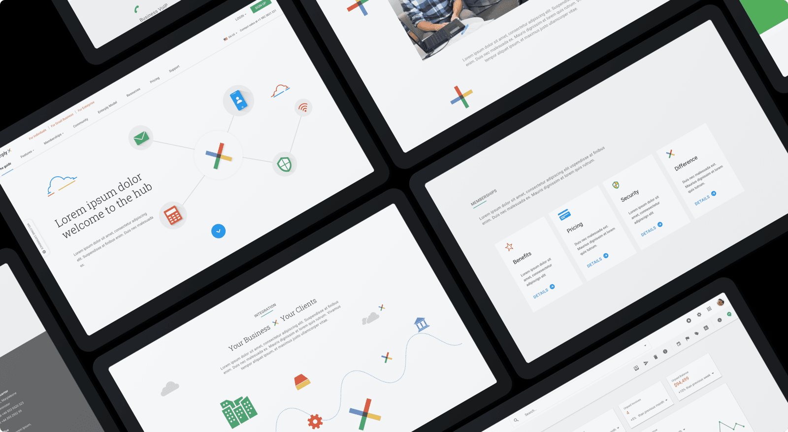
“So simple that my grandpa could use it” - One of the stakeholders at Enterply. We used Google’s Material Design to make a suite of applications very simple and easy to use. The easier something is to understand and use, the greater chance it will catch on and users will engage with it.
STAGE 1
- Product definition
STAGE 2
- Research
STAGE 3
- Analysis
STAGE 4
- Design
STAGE 5
- Validation
Wireframes & prototypes
Minimal & sophisticated. Our designs were simple but not to a point where a user cannot complete their objective. We used complex designs only to enhance the user’s experience, and removed everthing that were unncessary.
Tools
- Sketch
SCREENS DESIGNED
- 50+
colors
Mobile friendly
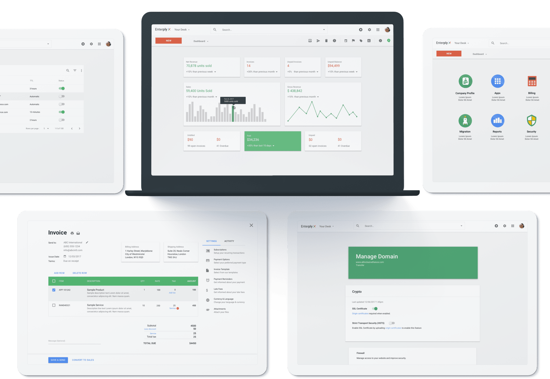
We used responsive web design and feature detection to deliver an optimized experience across all devices. The presentation changed but the core content was consistent everywhere.
TESTED ON
- Multiple andriod & iOS devices
- HD & retina displays
- iPads & tablets
- All major web browsers
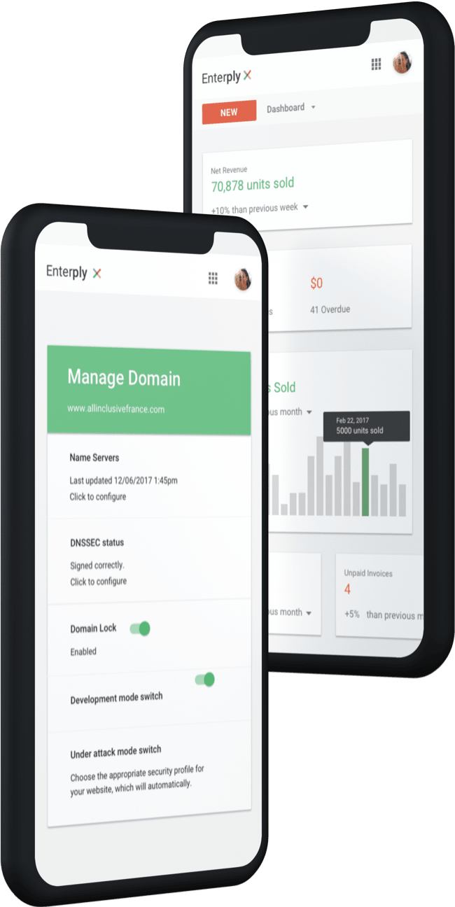
A summary of our deliverables
From a 50+ page requirement doc to an application suite in Material Design, it was one heck of a journey for us. The stakeholders were really pleased to see that their idea and vision from the doc was shaping into a functional web application. Here is what we delivered.
UX
- Product summary
- User personas
- Empathy map
- Jobs to be done scenarios
- Information architecture
- Wireframes
UI
- 50+ screens
- Clickable prototypes
- Sketch assets
- Style guide
FRONTEND
- Angular
- Material design
BACKEND
- DNW
You might want to check similar projects
Give us a challenge
Book a meeting with our project manager and share your project.
We don’t charge for meetings.
