Minimalism with WordPress
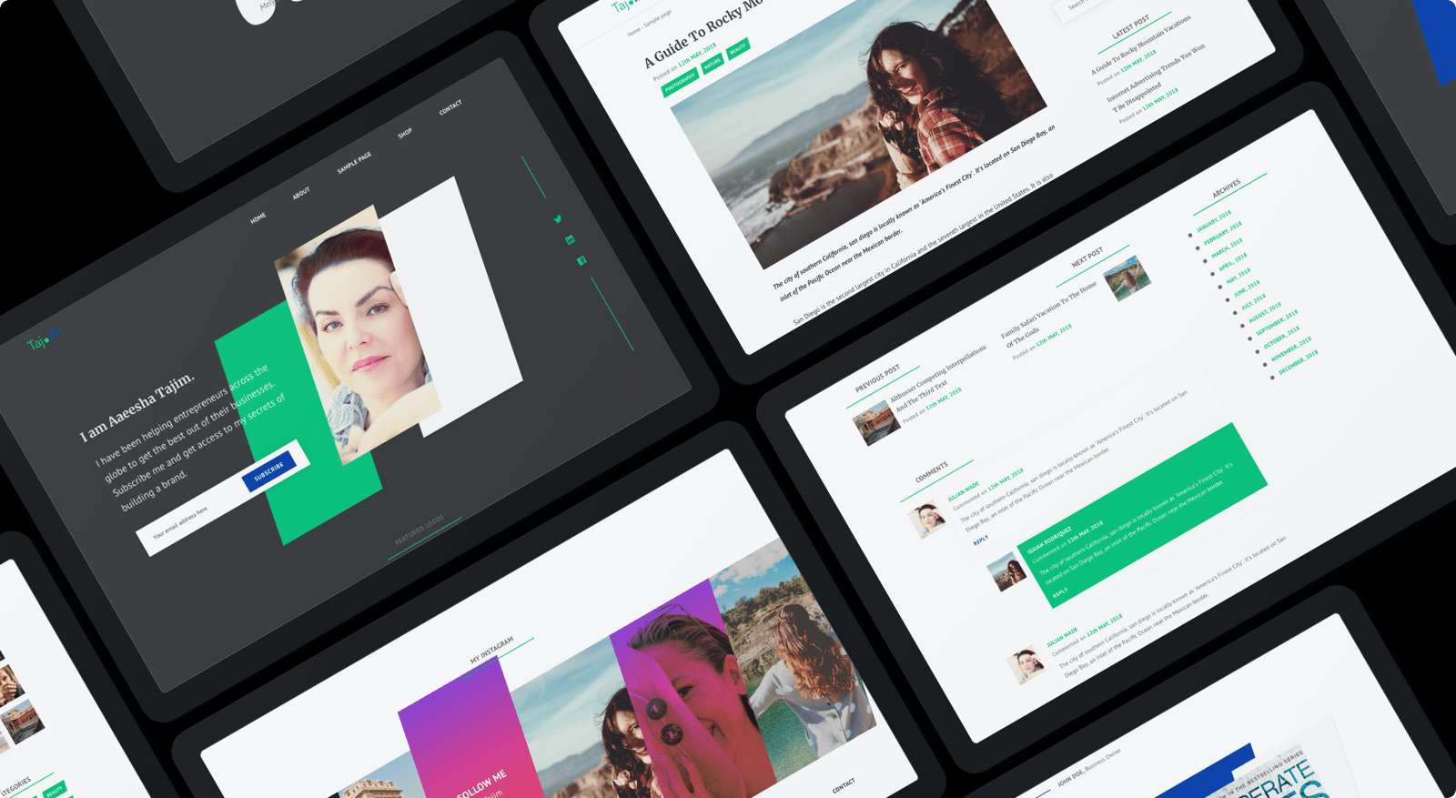
We convinced the client to go with a minimal design. A minimal, well lit space encourages participation and honest transparent communication. But crafting minimalism wasn’t easy. As the number of styles reduced, We had to pay extra attention to white space, colors and typography.
Wireframes & prototypes
With an assignment to create a minimalist website, We focused on typography and white space, which reinforces transprancey and professionalism.
Tools
- Sketch
SCREENS DESIGNED
- 20+
colors
Mobile friendly
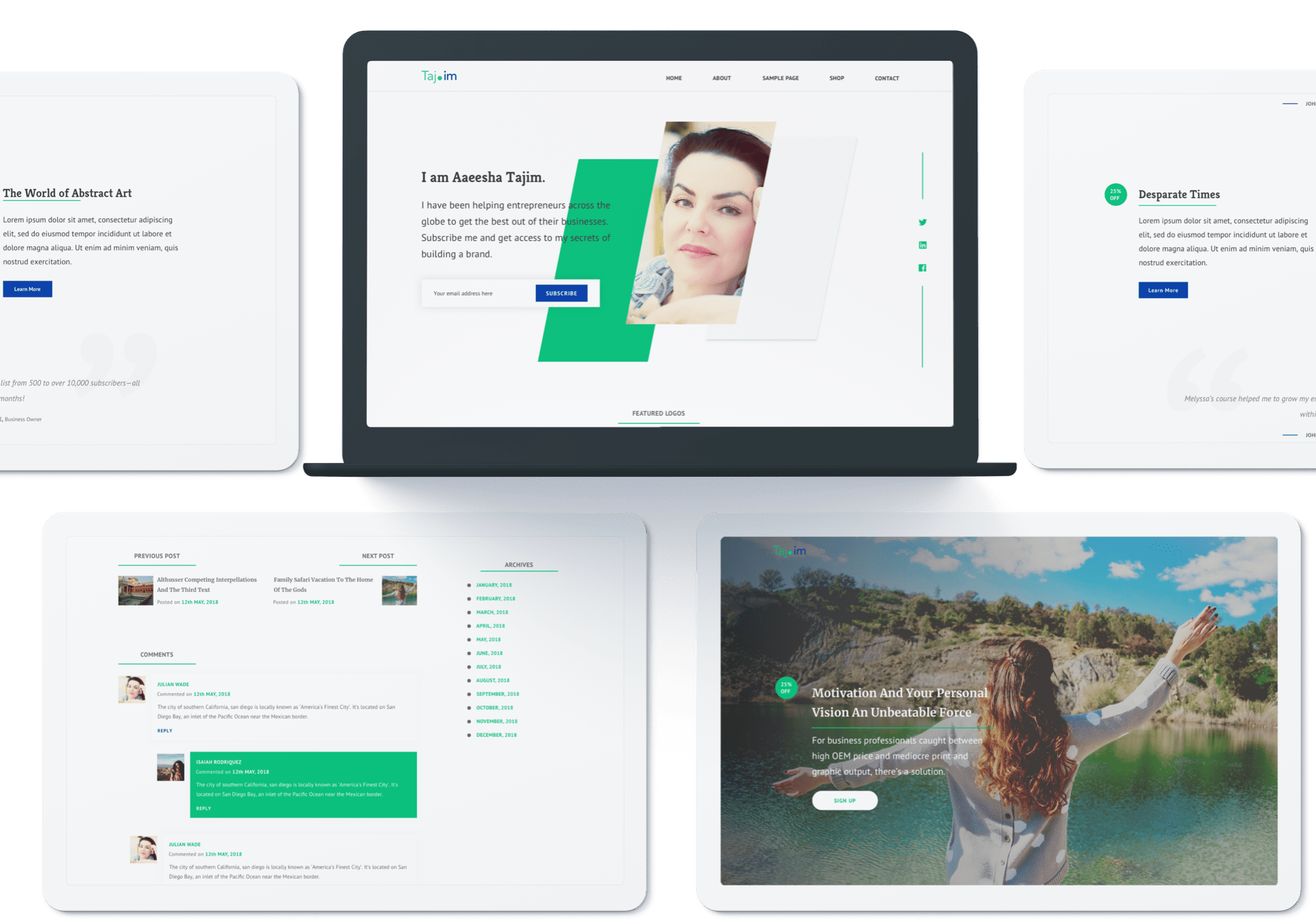
We used responsive web design and feature detection to deliver an optimized experience across all devices. The presentation changed but the core content was consistent everywhere.
TESTED ON
- Multiple andriod & iOS devices
- HD & retina displays
- iPads & tablets
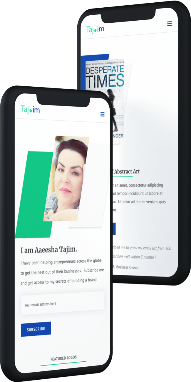
A summary of our deliverables
We created a user interface thats beyond anything you would expect from a author’s website. Theme Thread is minimal, has a lot of well lit spaces, bold typography and clear message not only grabbed user’s attention but also conveyed trust and professionalism.
UX
- Product summary
- Information architecture
- Wireframes
UI
- 100+ screens
- Clickable prototypes
- Sketch assets
- Style guide
FRONTEND
- DNW
BACKEND
- DNW
You might want to check similar projects
Give us a challenge
Book a meeting with our project manager and share your project.
We don’t charge for meetings.
