Rapid prototyping
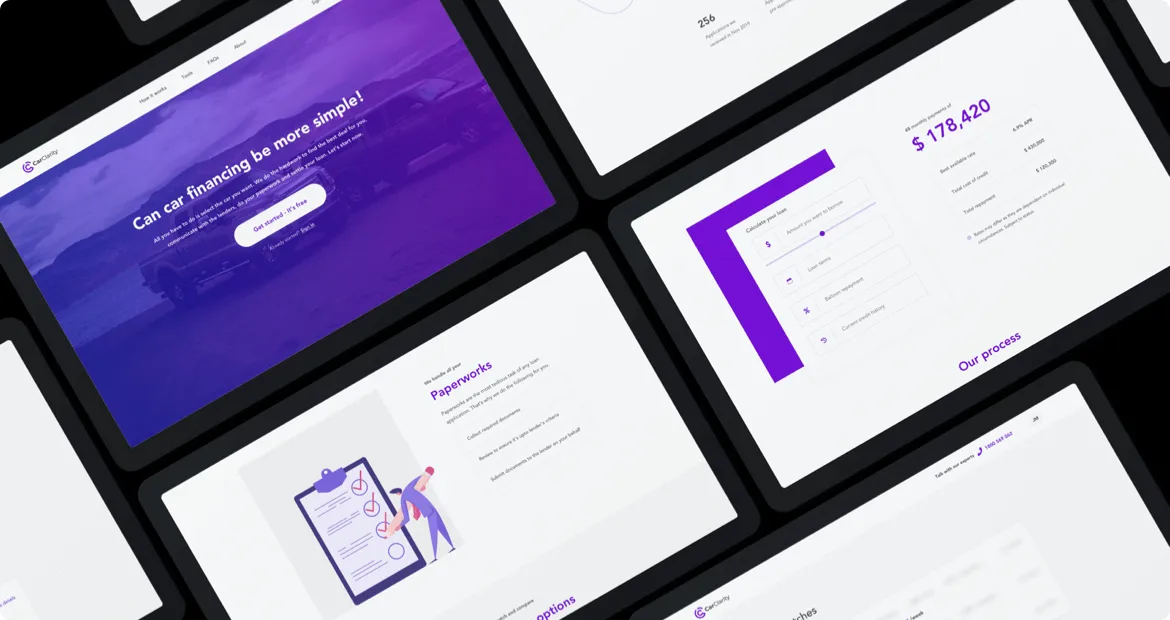
The stakeholders wanted a quick turnaround. We quickly created multiple prototypes, tested it with stakeholders to check how the concept, usability and viability of the product are received.
STAGE 1
- Research
STAGE 2
- Product design
STAGE 3
- Handover for development
Wireframes & prototypes
We did rapid prototyping to quickly communicate how the designs might work, share it with stakeholders, iterate and handover for development.
Tools
- Sketch
SCREENS DESIGNED
- 100+
colors
Mobile friendly
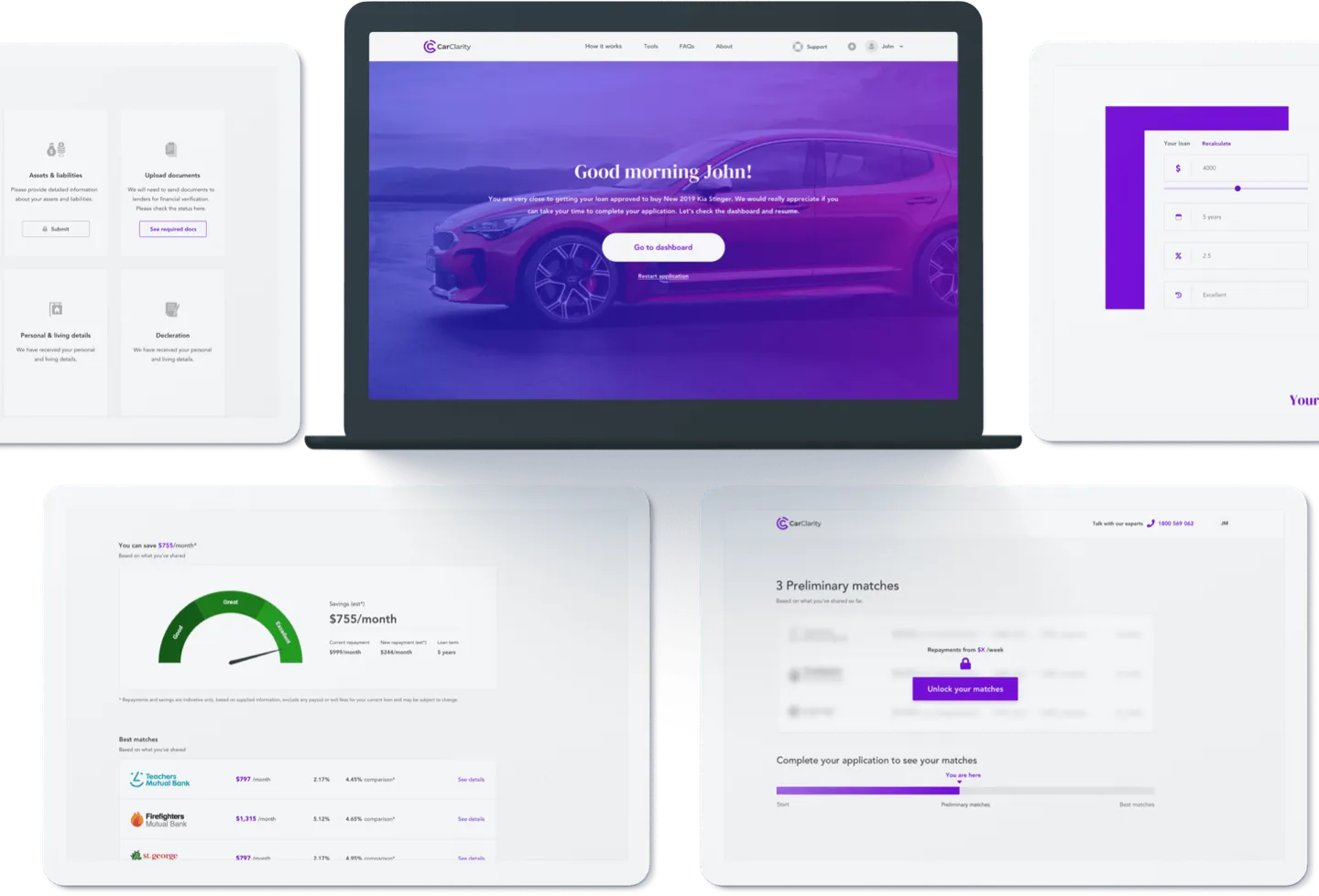
Designed with “Laptop First, Mobile Considered” approach, all the CarClarity screens were initially designed and approved on laptops. After approval, we designed the same content considering all popular mobile devices.
TESTED ON
- Multiple andriod & iOS devices
- HD & retina displays
- iPads & tablets
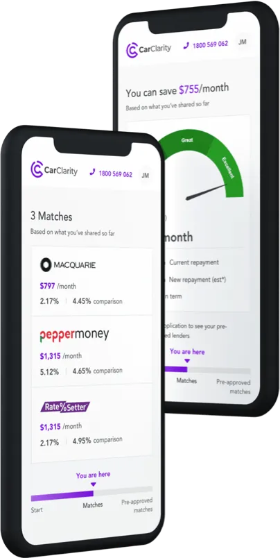
A Summary of our deliverables
Over 100+ screens and most of them were user inputs. Our challenge was to minimize the cognitive load that a user has when filling forms. The stakeholders were industry experts and with their insighs we figured out how we can motivate users to fill lengthly forms.
UX
- Product summary
- Information architecture
- Wireframes
UI
- 100+ screens
- Clickable prototypes
- Sketch assets
- Style guide
FRONTEND
- DNW
BACKEND
- DNW
You might want to check similar projects
Give us a challenge
Book a meeting with our project manager and share your project.
We don’t charge for meetings.
